
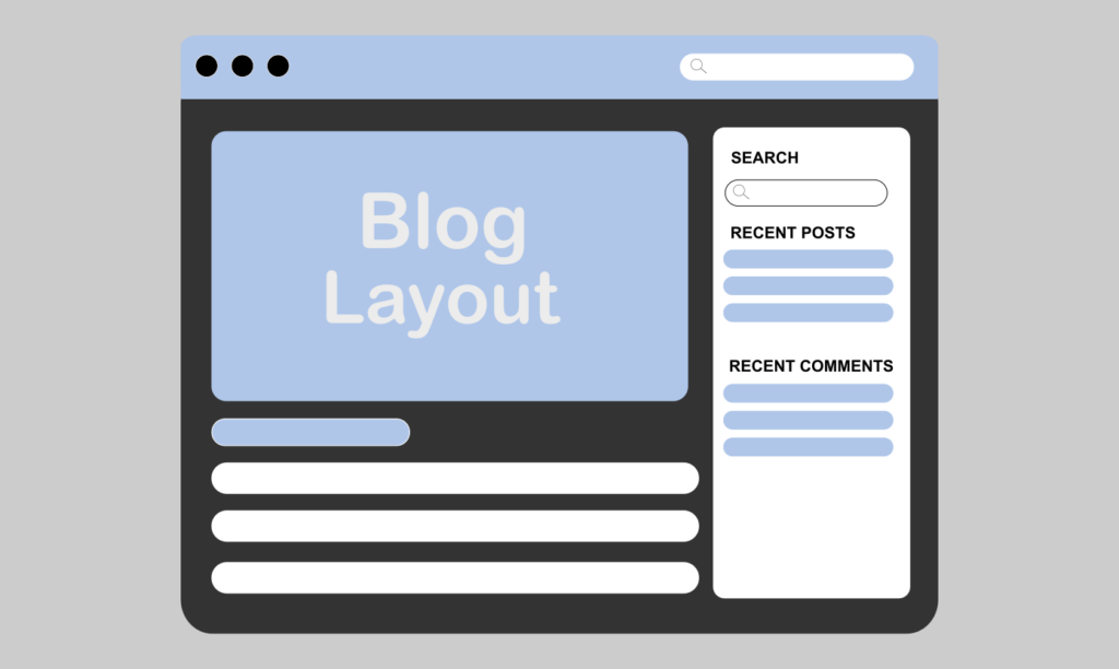
A good blog layout enhances the reading experience and encourages visitors to stick around longer. Visitors should be able to easily scan and find articles that interest them. In this blog post, we show you how to design your blog in WordPress with Elementor.
Why Blog Design Matters
The overall appearance of your blog impacts how readers perceive its quality. Readers want visually pleasing experiences, even if they aren’t consciously aware of it.
Visitors will pass over poor quality blog posts if they’re buried within a cluttered site full of images, flashy animations, and distractingly bright colors.
- A modern blog layout will:
- Allow visitors to scan your blog quickly
- Lead to more page views
- Improve user engagement
- Decrease bounce rates
- Build trust in your brand
- Increase mobile conversions
The easier you make it for visitors to read your content, the more likely they are to come back for more.
Pick Your Starter Theme
Before designing your blog layout, choose a lightweight starter theme compatible with Elementor. This theme will serve as the foundation for your layout so choose wisely.
Some of the most popular themes to build blogs with Elementor include:
- Astra
- Hello Elementor
- GeneratePress
- Kadence WP
A lightweight starter theme gives your website faster load times.
Plan Blog Structure
Before opening Elementor, think about how you want your blog structure to appear.
Most Modern Blogs Include the Following Sections:
Header Section
The Header Typically Contains:
- Site logo
- Menu/navigation
- Search icon
- CTA button
- Mobile menu
Keep your header simple.
Featured Blog Posts
Featured blog post widgets have become popular among modern blogs.
- You can feature:
- A selected article
- Latest blog post
- Most popular article slider
- Certain categories
Positioning these elements at the top of your blog instantly directs visitors to important content.
Blog Grid
Blog grids are popular because they provide a structured and neat look.
- Other benefits of using grid style blog layouts include:
- Easy scanning of articles
- Visually pleasing arrangements
- Better content exploration
- Optimized for mobile devices
Creating a blog grid with Elementor is easy with the Posts widget.
- Design Your Blog Layout in Elementor
- Step 1: Create a Custom Header
- To edit your header in Elementor:
- Open Elementor Theme Builder
- Create a new header template.
- Customize with your logo, menu, etc.
Add responsive overlap so your header looks good on mobile screens.
Consider making your blog header sticky if your site has long scroll pages.
Step 2: Add a Hero Section
The hero section captures visitors’ attention when they first arrive at your blog.
Include Your:
- Blog title
- A short description
- Featured image
- CTA button
Minimalist typography and increased white space is a common trend in modern blog designs.
Step 3: Display Featured Posts
Use Elementor’s Posts widget to show featured articles on your blog.
- Ideas for featured posts sections include:
- Most viewed
- Editor’s choice
- Latest posts
- Trending posts
Try enlarging the format of these posts compared to regular blog entries.
Step 4: Build the Blog Grid
Blog grids are where most of your content will live.
- Ideally, your grid will look like this:
- Three columns on desktop
- Two columns on tablet viewports
- One column on mobile
It Should Display:
- Featured image
- Title
- Date published
- Categories
- Short excerpt
Resize your media so all images are uniform in width and height.
Typography Tips
Blog typography is important. It makes or breaks your blog readability.
Apply These Settings:
Headers
- Font Size: 32px–48px
- Font Weight: Bold
- Make sure each header has a distinct size
Body
- Font Size: 16px–18px
- Line Height: Generous
- Use dark colors on light backgrounds and vice-versa.
Here are some of our favorite fonts to use:
- Inter
- Poppins
- Roboto
- Open Sans
Remember to stick with 2 font families maximum.
Use Negative Space
Negative space has been a massive trend in modern website design. Successful blog layouts aren’t cluttered with dozens of different colors and widgets.
They focus on readability and what’s truly important.
- Here’s how you can use whitespace:
- Make content easier to skim
- Draw attention to your CTAs
- Establish a high-end look
- Eliminate unnecessary stress on readers
Don’t be afraid to leave empty space on your blog.
Design a Valuable Sidebar
While not every blog has a sidebar, most blogs you come across will.
Sidebars are great for placing additional elements you want visitors to see such as:
- Search box
- Popular posts
- Categories
- Subscribe form
- Author bio
- Social icons
Don’t fill your sidebar with every widget you can find.
Responsiveness Is Key
Mobile traffic continues to grow as more people browse the internet using cell phones.
Currently, there are more visits to blogs from mobile devices than desktop computers.
With Elementor, you can design custom layouts for desktop, tablet, and mobile viewports.
- Tips for mobile optimization:
- Use bigger buttons that are easy to press
- Reduce large margins
- Compress image file sizes
- Test your menu hover states
- Check that text is readable on smaller screens
Google favors websites that are mobile-friendly.
Include Dynamic Content
Dynamic content can greatly improve user engagement.
- Popular dynamic content features include:
- Related post section
- Author bio box
- Reading progress bar
- Estimated read time
- Previous/next post links
Try adding a plugin like Dynamic Content for Elementor to help you add these features.
Blog Page Performance
High-quality blog designs don’t have to slow down your website.
Apply These Optimization Tips:
Optimize Images
Utilize a Plugin to Help Compress Images Such As:
- Smush
- ShortPixel
- Enable Caching
- Install a WordPress caching plugin to help reduce load times:
- LiteSpeed Cache
- WP Rocket
Limit Useless Widgets
Do not add blogs plugins and widgets you do not need.
While Elementor is extremely powerful, too many elements can increase load times.
Boost Reader Engagement
You should also look for ways to boost reader engagement on your blog.
Here are some ideas to get you thinking:
- Allow readers to leave comments.
- Enable visitors to subscribe to your newsletter.
- Include a related posts section.
- Add social sharing buttons
- Add a sticky table of contents to long-form posts
- Use exit-intent popups
When readers visit your blog, you want them to delve into every aspect of your content. Think of ways to funnel them to other pages on your blog.
Follow Basic SEO Practices
Search engine optimization ties into blog design. Make sure your blog lays out HTML elements like:
- Proper use of header tags
- Fast page speeds
- Mobile-friendly themes
- Clean internal linking
- Image optimization
- Schema markup
While there’s plenty you can do on your own, SEO plugins like Rank Math SEO can help you make your blog more discoverable.
Blog Design Tips to Avoid
Here are some common web design pitfalls you should avoid when designing your blog:
- Using too many colors
- Typography isn’t consistent
- Not optimizing image sizes
- Using too many animations
- Crowding your sidebar with widgets
- Not making your blog mobile-friendly
Whenever possible, opt for simple designs with beautiful photography over heavily designed pages with complicated layouts.
Modern blog designs don’t have to be complicated. By utilizing grid layouts, responsive themes, comfortable typography, intuitive blog structures, and fast page speeds, you can create a blog that rivals professional blogs. Thanks to Elementor and WordPress, beginners can easily learn how to make beautiful blog pages in WordPress.